2022
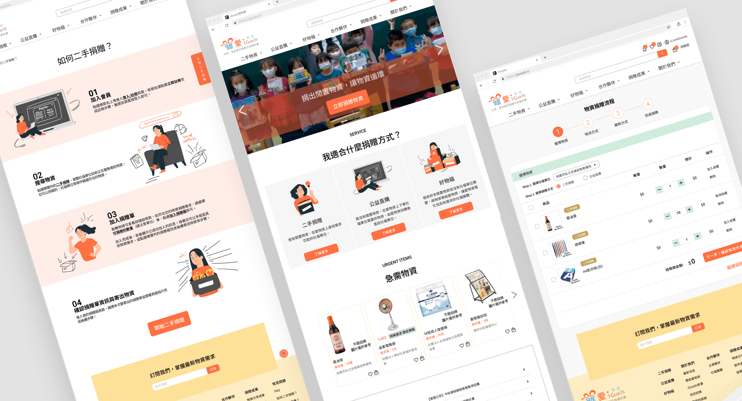
Optimization of the iGoods Second-Hand Donation Platform
Enhancing the donation process to increase completion rates.
| Duration | |3 Months |
| My Role | |User research and interviews, UI ideation, Prototype, Usability testing |
| Team | |5 UI/UX Designers |
| Tools | |Figma, Illustrator, Google Diagram, Google Meet, Maze |

Background
iGoods started in 2013, developing a website to connect material donations with social welfare organizations.
However, as the organization grew, the website required more functionality and a better user experience.
About Project
This is a re-design project hosted by UXY Bootcamp, cooperated with social welfare organizations- iGoods. With a team of 5 UI/UX designers, we focused on redesigning the second-hand donation process, helping to solve business problems and providing a better donation experience. our final goal was to conduct a survey of donor profiles and optimize the donation process and experience to achieve the goal of increasing the success rate of donations.
Product User Problems
Through user research and analysis, we identified key pain points in the current iGoods platform that were hindering user experience and donation completion rates.
🔍 Current Problems
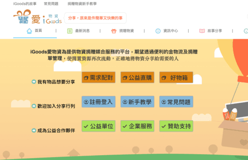
Information Overload
The page contains too much information, making it difficult to read and causing confusion. The material search and checkout processes are complex.
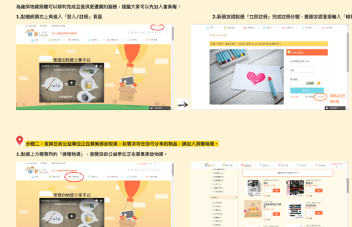
Donation Method Confusion
Multiple donation methods are provided, but newcomers may find it difficult to understand the differences and processes of each donation method.
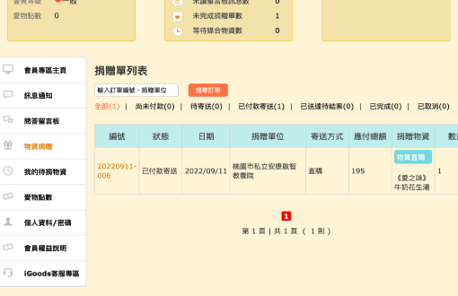
Lack of Tracking
After donating goods, donors cannot track the logistics status of the donation order because the website lacks a message notification function.
💡 Our Solutions
Simplify Information
Optimize the page to make the information easier to read and streamline the process of second-hand donations to make the process smoother.
Clear Guidance
Optimize beginner's guide for donation services, so that donors can easily find the information they need.
Enhanced Tracking
Update the donation list page and add an in-site notification feature, so that donors can have a clearer understanding of their donation progress.
Our Design Process
We are optimizing the second-hand donation process for the Love Donation website.
The ideation and design process includes the following four stages:
Research
User interviews, competitor analysis, and understanding current pain points
Define
Persona creation, user journey mapping, and problem definition
Ideate
Brainstorming solutions, wireframing, and information architecture
Design & Test
Prototyping, usability testing, and iterative design improvements
User Understanding
The early stage research includes questionnaire surveys, user interviews, and competitor analysis, to understand the strengths and weaknesses of the existing website and identify differences from competitors. Based on the research results, we will define the persona and user journey map for the target audience in the later stage.
📌 Research
Competitor Analysis
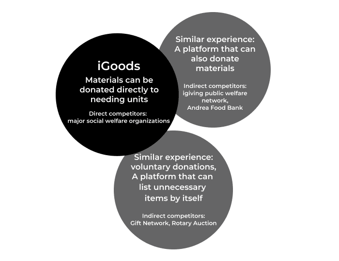
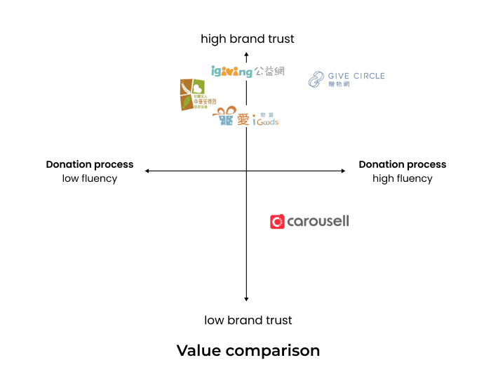
Identify the direct and indirect competitors of the product in the market and compare them based on product characteristics. Use a table to clearly organize the differences between competing products and position the product value.
Direct competitors
Indirect competitors
User Interviews
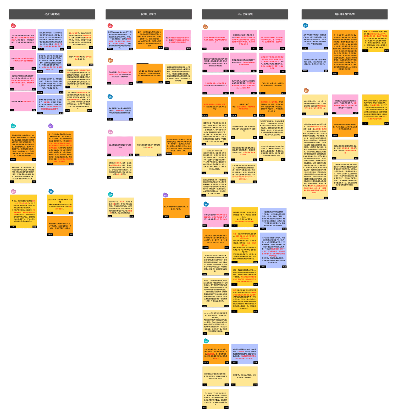
We conduct a questionnaire survey before user interviews to understand the main user groups and define the target user profileA total of 32 questionnaires were recovered, and 5 suitable users were selected and conducted in-depth interviewsThe interview is divided into two blocks: Situation exploration and user interviewUse this to observe and understand the user's usage habits, and use it as a reference for subsequent optimization of the website
Interview Findings
Through user interviews, we can know the habits of users when using donation platforms, including how to choose platforms, social welfare units, why to donate, how to donate, etc., which will be used as important indicators for website optimization.
Key Factors in Choosing a Donation Platform
Most of the interviewees said that whether the matching conditions are met is more important than the image of the donation platform
Key Factors in Determining Social Welfare Units
Most of the interviewees said that they would first look at the material needs before choosing the social welfare units to donate to
Factors Deciding to Donate
Most of the interviewees said that whether the matching conditions are met is more important than the smoothness of platform donation and the convenience of logistics
Preferred Donation Method
Most of the interviewees said that it is troublesome to donate materials one by one, but they prefer to use the functions of direct shopping and gift box
Concerned about the Final Flow
Most of the interviewees are generally concerned about the care about flow of material donations
📌 Define
User Persona
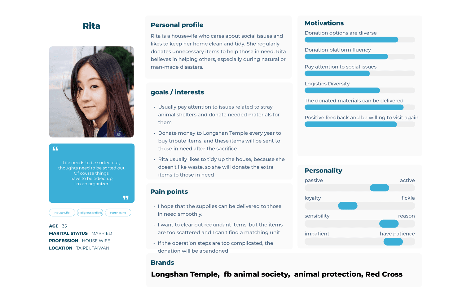
After integrating and analyzing the survey data collected according to customer exploration, a main character profile is established.With Rita as the representative of the main target group, this type of person will be the main group of people who use the love material website
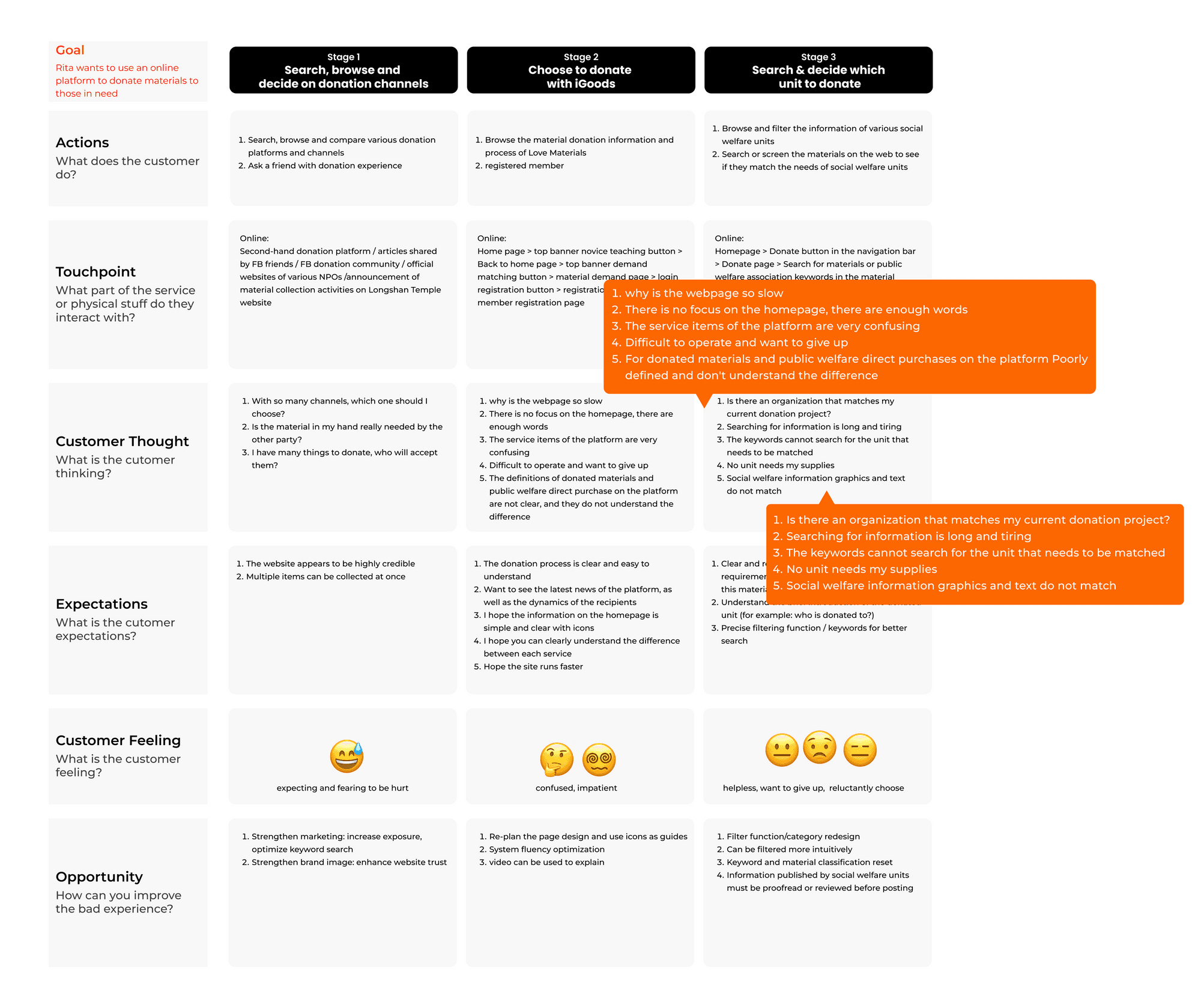
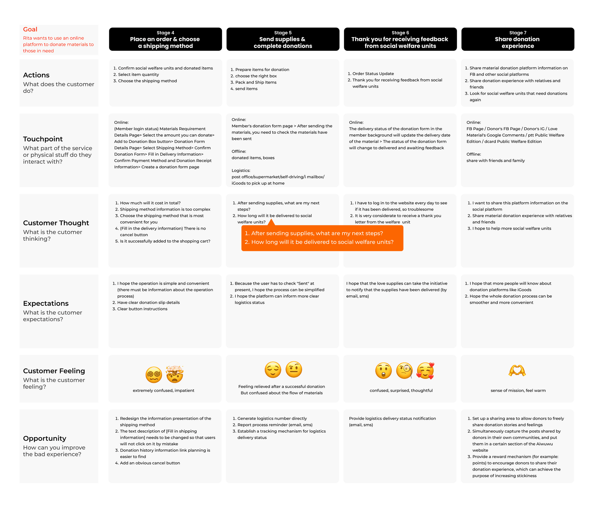
User Journey
Through User Journey, I understand that the overall layout design of the webpage, whether the search mechanism is perfect and accurate, and whether the donation process planning is clear will all affect the donor's experience and mood
Search & Browse
Search, browse and decide on donation channels
Choose iGoods
Choose to donate with iGoods
Select Unit
Search & decide which unit to donate
Place Order
Place an order & choose a shipping method
Send Supplies
Send supplies & complete donations
Receive Feedback
Thank you for receiving feedback from social welfare units
Share Experience
Share donation experience
Problem to Solution
Through interviews, understand the parts that have not been met and are individually valued, find out "what is the most important issue for donors at present", and pick out the most important insights and opportunities to meet the needs as the main purpose
What's the problem?
POV Statement
Problem 1
Search or filter on the donated materials page whether the materials in hand match the needs of social welfare units, because it's important for her to know if there is an organization that matches the project she's currently donating to.
Problem 2
Spend the least amount of time to understand the material donation information and process of love materials, because it is very important for her to be able to quickly and conveniently complete the delivery and whether the website experience of the donation platform meets expectations.
Problem 3
Search or filter on the donated materials page whether the materials in hand match the needs of social welfare units, because it's important for her to know if there is an organization that matches the project she's currently donating to.
What are the right questions?
How Might We
HMW Question 1
Why don't we design the filter as like a shopping site?
HMW Question 2
Why don't we remove unnecessary information and explain the process with simple icons and text?
HMW Question 3
Why don't we use off-platform channels to notify logistics status?
Crazy 8 Sketches
HMW Question 1
why don't we design the filter as llke a shopping site?
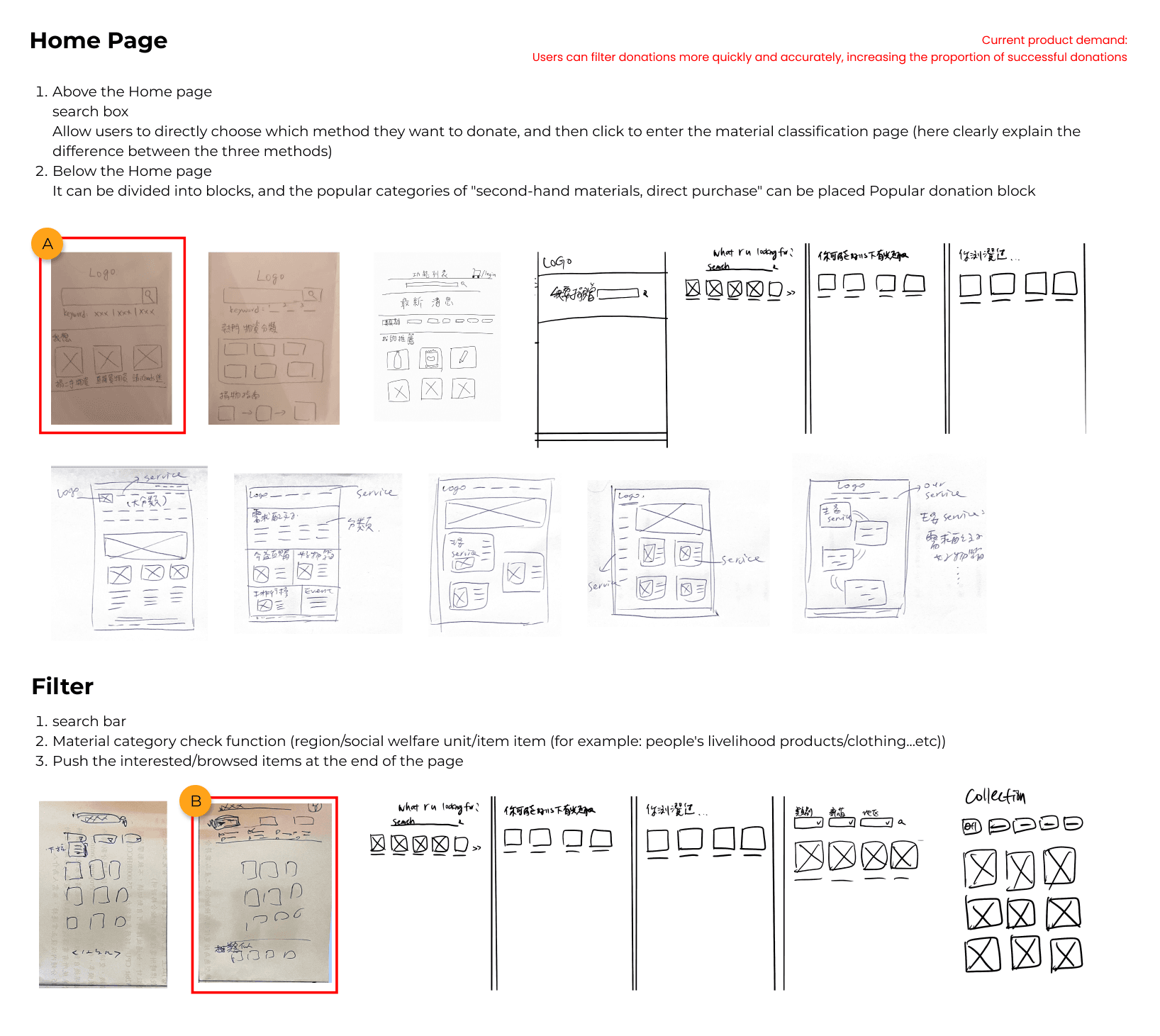
HMW Question 2
why don't we remove unnecessary information and explain the process with simple icons and text?
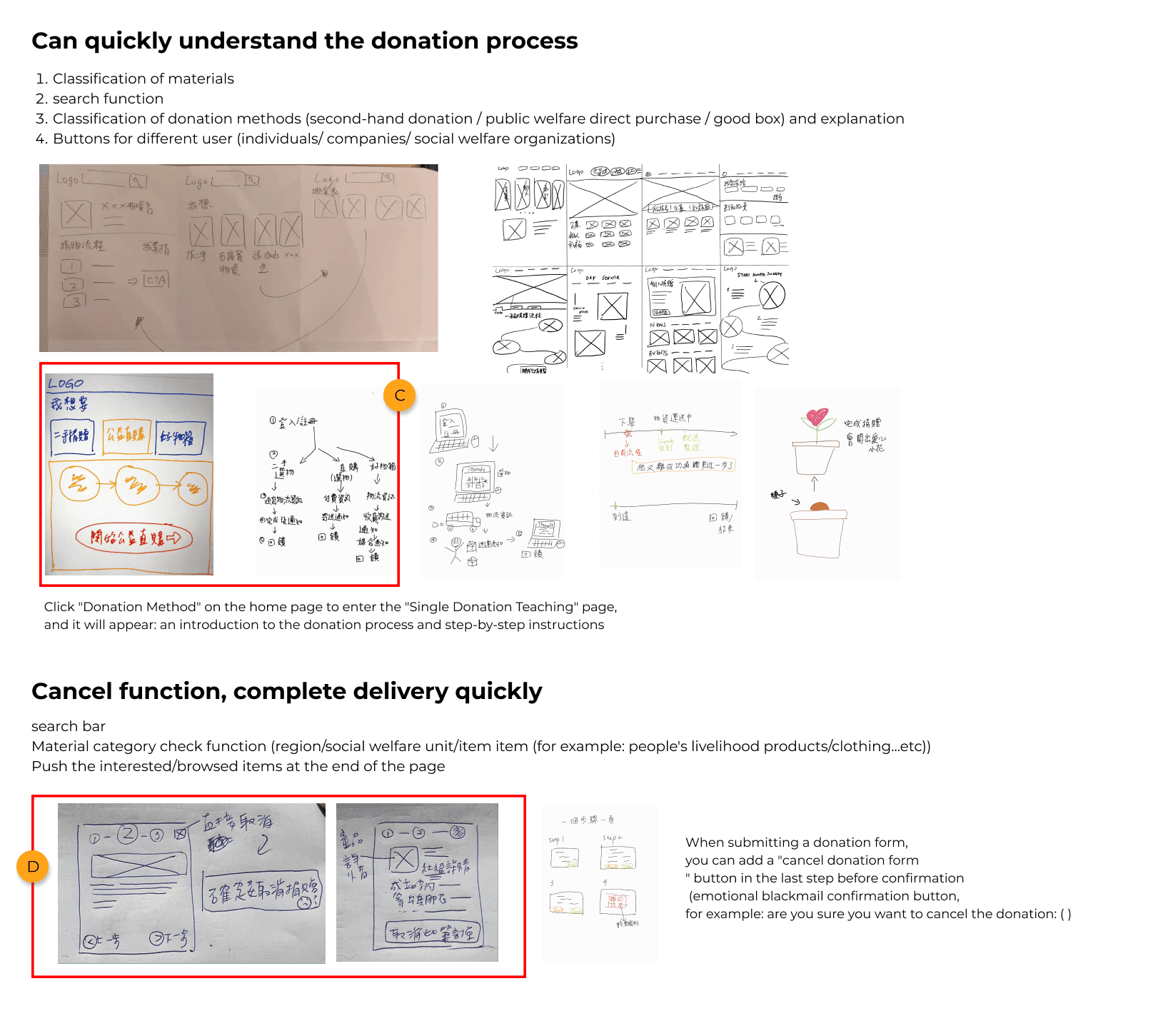
HMW Question 3
why don't we use off-platform channels to notify logistics status?
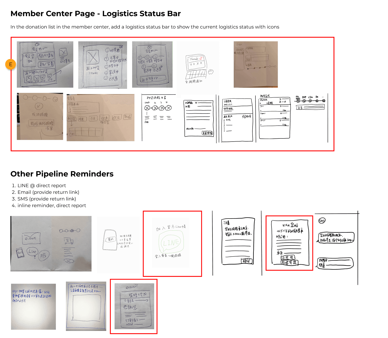
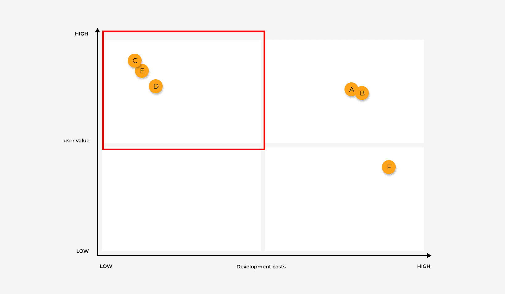
📌 Ideate
User Flow
Looking back on the previous Persona, think from the perspective of the user and draw the Task Flow and User Flow
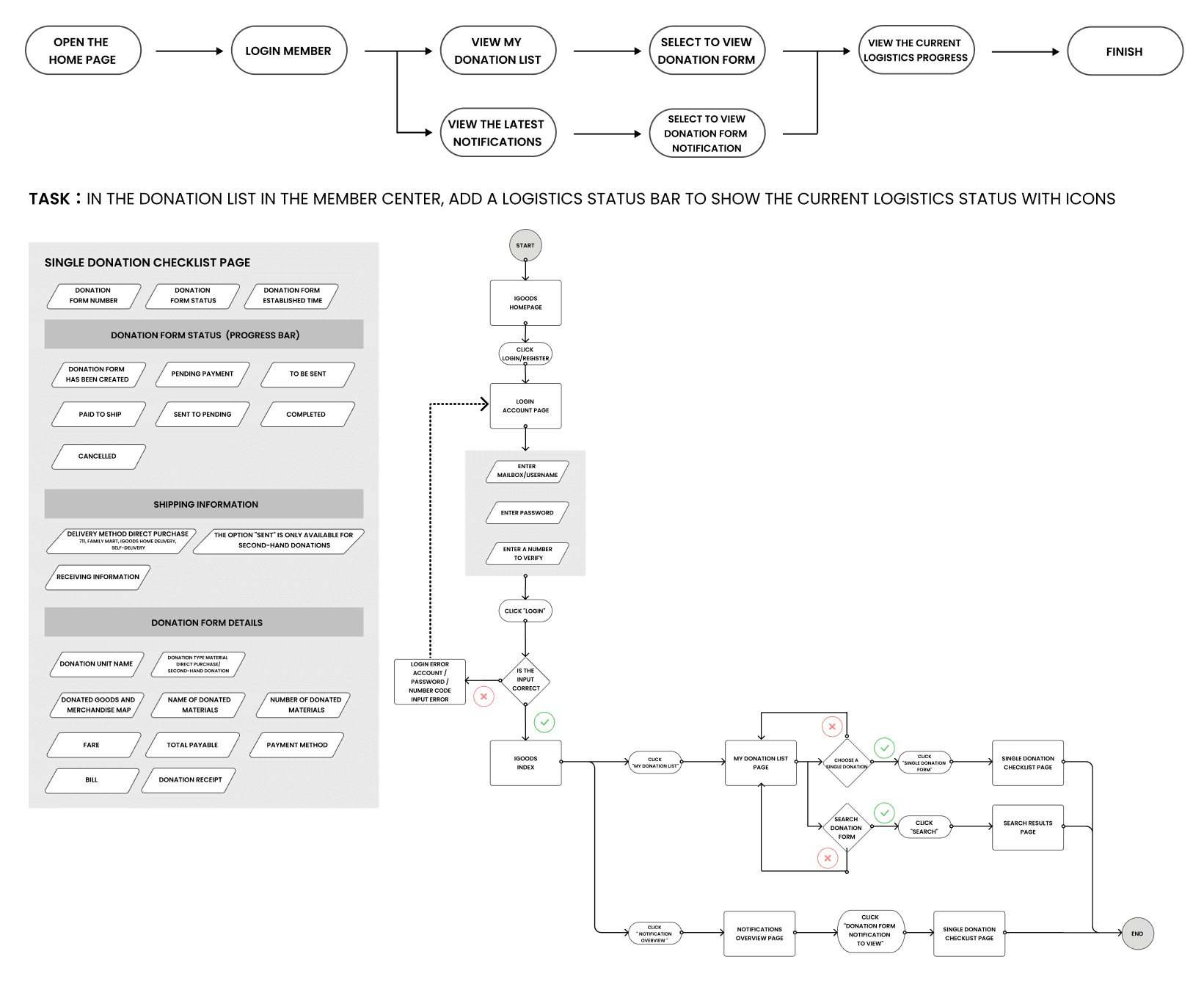
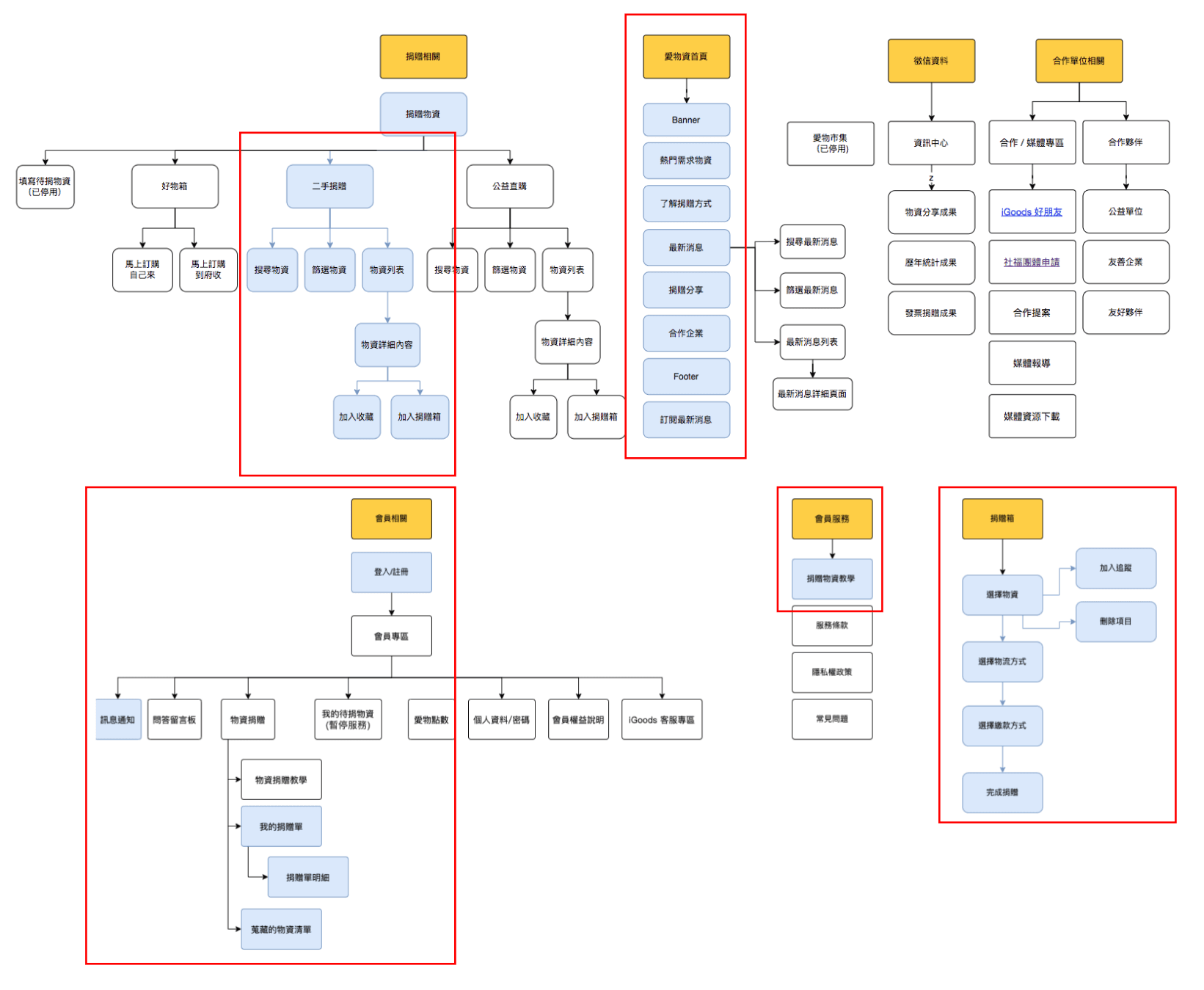
Information Architecture
Optimize the information structure for the home page, second-hand donation process, member login registration, donation form, and notification
📌 Design
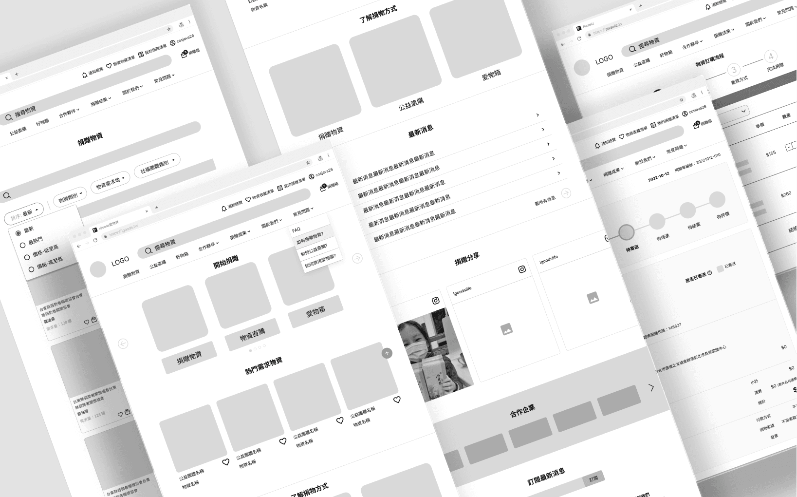
Wireframes
Based on the information architecture, after confirming that all page elements such as content, layout, and functions conform to the overall design, according to wireframes,Can identify key actions and allocate resources appropriately before actual product development
User Tasks
Key user interactions and workflows designed to improve the donation experience
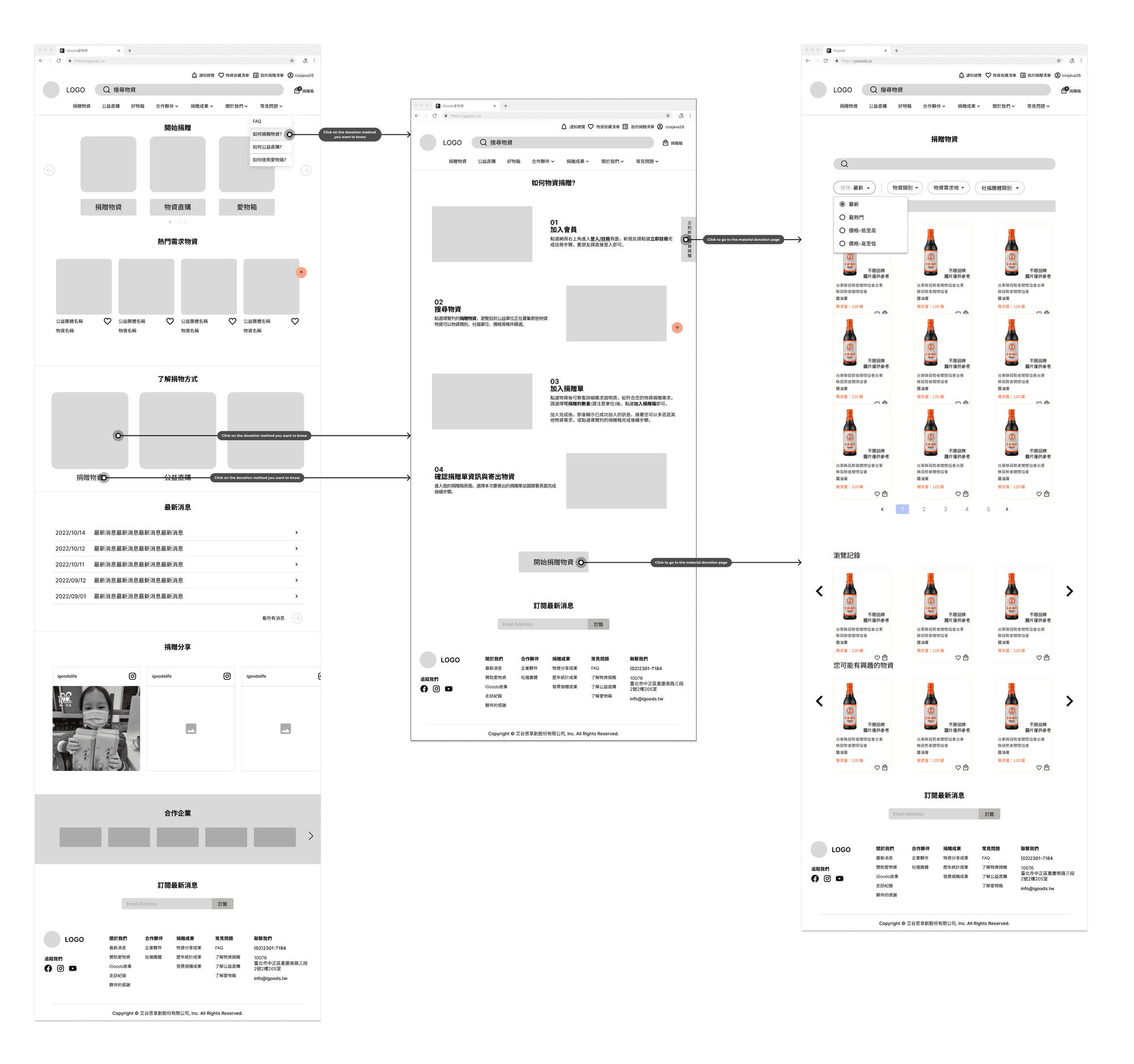
Donation Method Selection
Click the donation method on the homepage to enter the donation method description details page
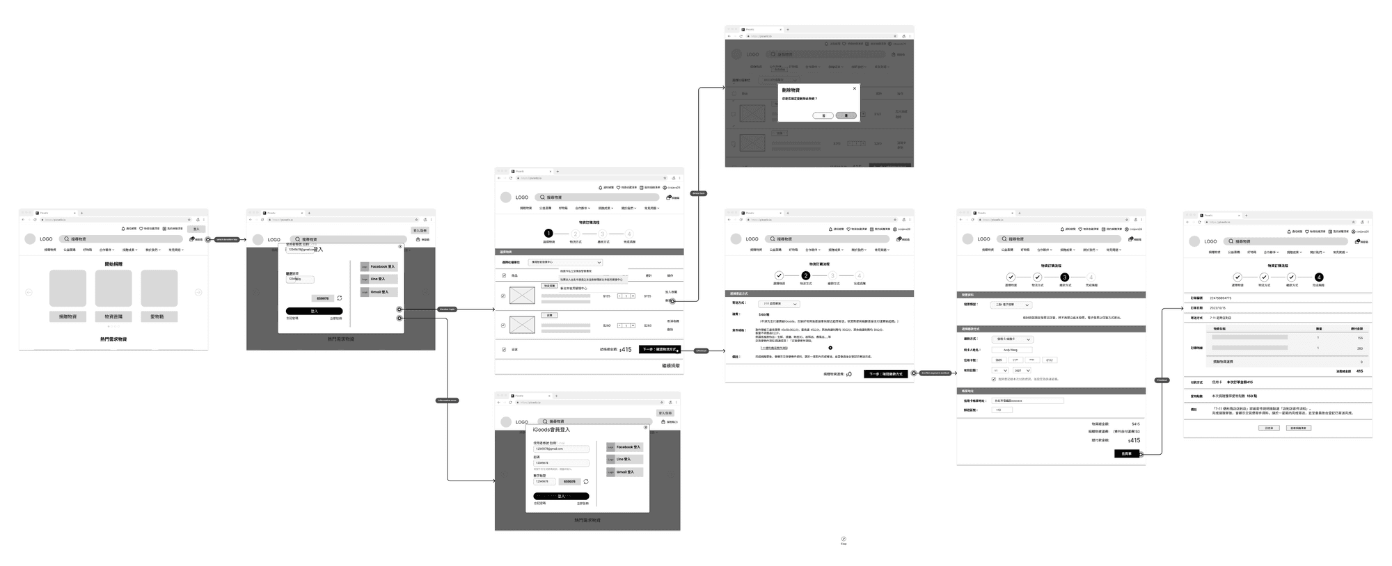
Donation List Management
Go to the donation list to check out the materials or delete the item
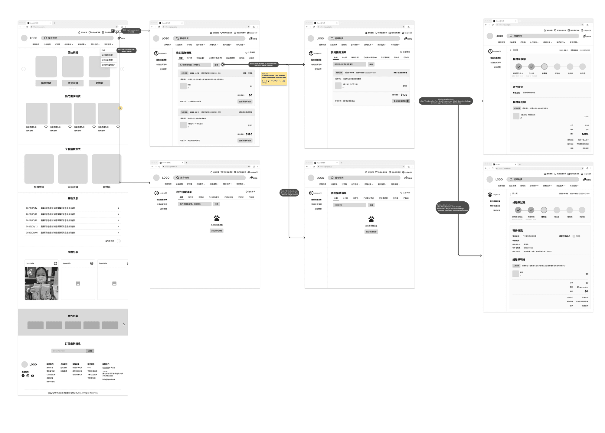
Logistics Status Tracking
Rita who has completed the donation form wants to confirm the logistics status of his current supplies
Design System
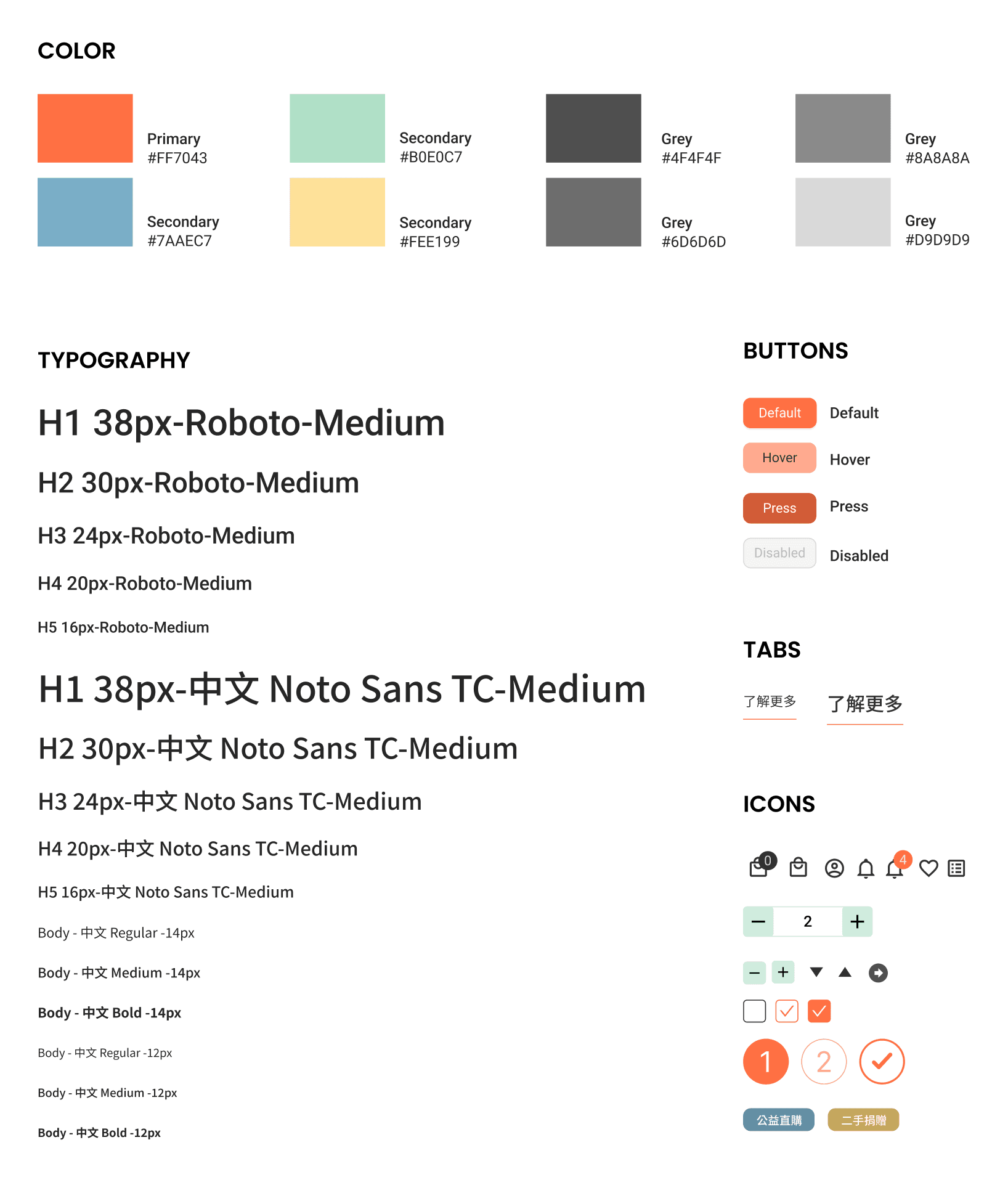
Through the formulation of the emotional board, the main color is orange, the brand color, supplemented by healing and emotional yellow, green, and blue, so that the mind and material can achieve a positive cycle
Prototype
Draw Hi-Fi Mockup according to wireframes to make clickable prototypes
💡UI Redesign
Goal
How to enable donors to quickly find the services they need as soon as they enter the website without being disturbed by too many pictures and texts, so as to speed up the donation process?
Feature
Redesign the layout and remove excessive text information, so that donors can enter the service project from multiple entrances at a glance from the home page
💡Search bar, material category filtering function
Goal
How to optimize the material demand list page, so that donors can be more accurate and efficient when screening materials?
Feature
In addition to separating different services, the filter also adds a sorting function to make material screening more accurate and speed up donation efficiency
💡Material donation process is simplified
Goal
How to enable donors to complete the donation smoothly and efficiently after selecting the required materials?
Feature
The registration and login page adds a community linkage function to shorten the login time. And after selecting the materials to be donated, the selected social welfare units, logistics and payment methods will be presented separately, so as to complete the order clearly and quickly
💡Add logistics status bar and notification function
Goal
How to enable donors to clearly grasp the progress and flow of materials on the website after donation?
Feature
The donation list page is subdivided by service, so you can quickly find the donation form. In addition, you can also find the relevant updates of all donation forms through the notification function on the home page
📌 Test
Usability test
Find out whether the new design can help users reduce the time for exploration and understanding, and complete second-hand donation smoothly and quicklyKnow whether users can check the status of donation slips and check the details of historical donation slips when they return to the website
Test methods and tools
Maze, Google meet, System Usability Scale
Subjects
5 respondents who underwent customer discovery analysis
Test Date
Nov. 2 & 3 & 4, 2022
Findings
Navigation Issue
On the home page, the subject intuitively clicks the donation button on the navigation bar or banner to directly enter the donation list page, but cannot find the donation method description page
Filter Confusion
Respondents responded that using price as a filter was a bit strange
Information Overload
There are too many words on the material card, and the testees tend to confuse the name of the product with the name of the social welfare unit, and suddenly lose the focus
Donation Type Confusion
On the "Donation List" page, I can't clearly distinguish the donation slips of "Direct Purchase for Charity" and "Second-hand Donation", and I can't tell the difference between them
Search Functionality
On the "Donation List" page, the testee wants to use the name of the material to search for the historical donation list
Notification Overload
There are too many texts in the floating window of the message notification function, and the testees are easily confused
Progress Reporting
On the "Donation List" page, the testees can't understand the intention of reporting the progress after sending out the second recipient's materials, and they will easily forget and find it troublesome
Refine the design
After usability testing, we made design iterations for each page and function:

Final visual designs
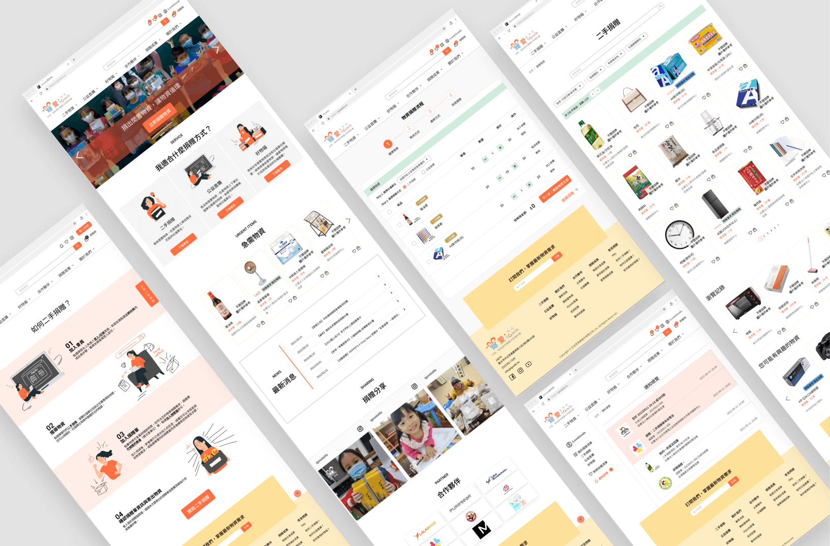
The optimized and iterated Aiwu website not only has a more streamlined and clean overall page design, clearer and easier-to-understand guides for relevant information content, and easier operation of the donation process, but also adds new notifications on the site so that donors can grasp relevant logistics information at any time
Outcomes
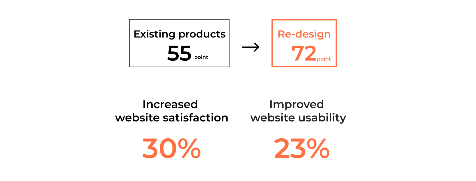
After usability testing through Maze, we got a comparison with existing products and positive feedback from the testeesAnd from the SUS scale to get the improvement of satisfaction
Feedback 1
The fluency and design of the overall website has become easy to use, and I will be willing to use this website in the future.
Feedback 2
I really like the function of being able to log in with the community. It is very convenient to log in directly with gmail.
Feedback 3
You can use the filtering function very smoothly, and quickly find materials using the collection function and adding them to the donation box.
Feedback 4
The description and typesetting of individual pages of materials are comfortable and easy to read.
📌 Takeaways
Next step
Due to the time limit of the project, it is currently only optimized for second-hand donations. There are still many issues worthy of discussion and as the goal of continuous optimization.
Optimize other service processes
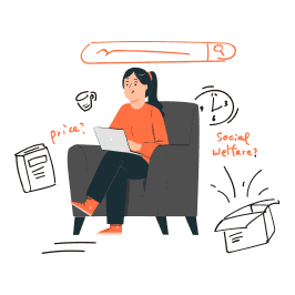
Given the project’s limited timeline, the current focus is on optimizing the second-hand donation process. Future improvements will address other iGoods services, such as direct purchase for charity and the “Good Goods Box.”
Balancing donation supply and demand
Beyond refining the donor experience, we also consider the material needs of social welfare organizations to enhance the platform’s overall supply–demand experience.
Website interface style repositioning

As iGoods repositions its brand toward professional services, future discussions will center on updating the website’s color scheme and style to align with the new brand direction.
📌 What I learned
Make good use of design methods and smoothly carry out projects
From existing product review to competitor analysis, learn more about the advantages and disadvantages of existing products; then focus on target groups through questionnaires and interviews, and listen to users’ thoughts and opinions on products; finally, develop ideas and verify prototypes through design methods. is a solid design process
Communication skills training and improvement
Learning how to effectively communicate with stakeholders is a valuable experience. How to use professional knowledge to solve problems, from focusing on products to presenting relevant research data, opinions and designs, requires repeated confirmation and discussion. And learn how to meet the needs of stakeholders while maintaining the principles, and then achieve a balance
Teamwork, open mind and listening to each other
The online cooperation mode tests the cohesion and time allocation of the team. It requires self-discipline, complementarity, and mutual listening. During the meeting, generously put forward opinions, exchange opinions, and provide mutual assistance in a timely manner. Learn how to complete project goals with team partners within a limited time. Product satisfaction after re-design increased by 30%, which is a great encouragement to the team
Keep an open and positive mind
Sharing design results through different types of meetings, listening to the feedback given by teaching assistants, mentors, and guest lecturers, and gaining different perspectives are very nourishing for the promotion of the project. Avoid shutting in a small room for design, accept good suggestions with an open mind, clarify problems that you don’t understand, and let go of those that contradict users, so as to achieve a common goal
About UXY
Bootcamp, User Experience Design Bootcamp, User Experience Design
UXY is a mentor-led, project-based design bootcamp educating emerging UX/UI professionals in Asia. The topic covered in the bootcamp include: stakeholder interview, usability testing, competitor analysis, qualitative research, result synthesis, POV/HMW ideation, design collaboration, Figma prototyping, case study building
Project Achievements
1. 22's Fall Honorary Student
2. Redesign of project the iGoods website. Website use satisfaction increased by 30%, and website usability increased by 23%.